I've been fortunate to work on a bunch of cool design projects over the years, so collected here are some of my favorites, and the ones I'm most proud of, along with descriptions for why they were created and some details on the design choices.
"TOGETHER"
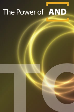

This is a series that was created for UWEC's Education Studies department. My internal title for this was the "Retreat to Move Forward" but of course, that's ridiculous (just a joke from 30 Rock!) so we called it "Together" for the actual event. The purpose of the meeting was to bring teachers together from around the area to talk with the University to align the training of teachers at the college level to the goals of the individual schools. So the design was split apart into these five pieces, each invitee getting a random piece. Individually, the pieces mean nothing. Assemble them with people who got a different piece, and the whole image comes together.
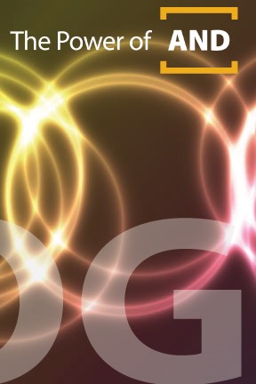
"connECt"
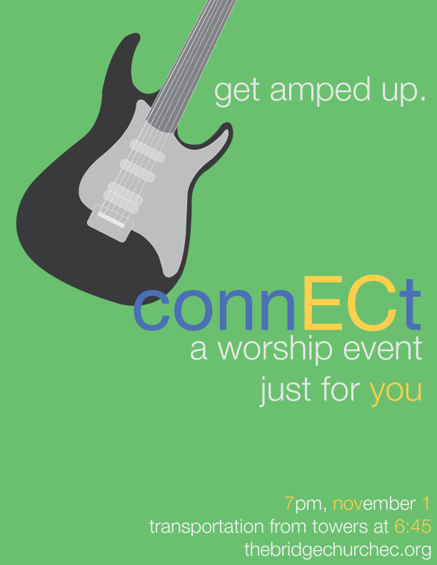
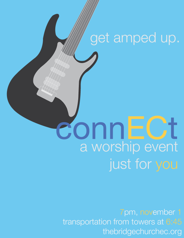
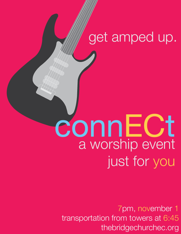
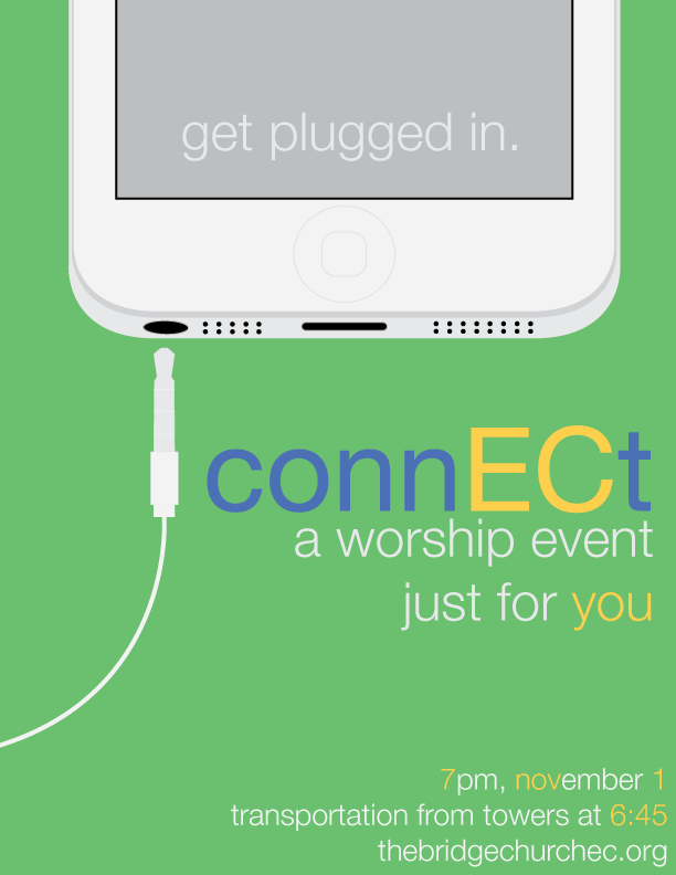
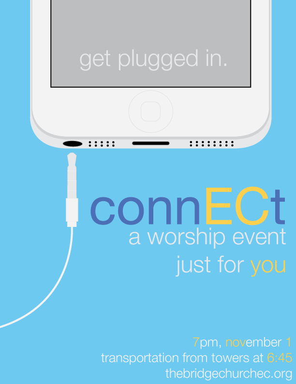
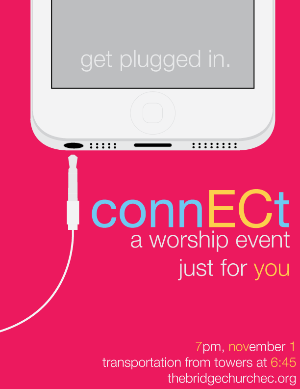
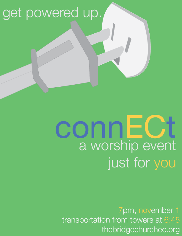
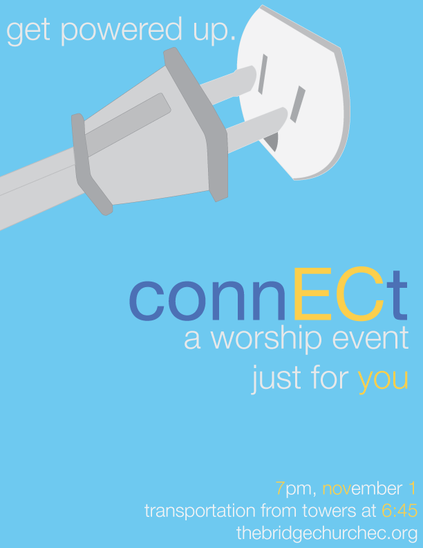
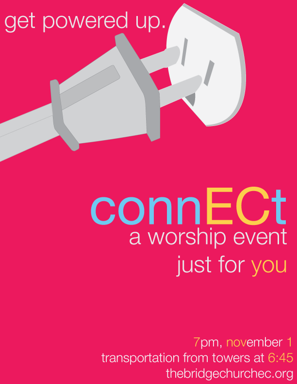
This might be my favorite design project I've ever done. I had so much fun working on this. I did this around the time that the iOS 7 design overhaul was hitting the market, so it was an awesome opportunity to work within that aesthetic. These were promotional posters for a concert our church band was putting on (a band in which I was the drummer) in an effort to engage with more local college students that were looking for a church home. So we wanted to connect with them, and we were in Eau Claire (EC), and the school colors were blue and gold....and thus I arrived at connECt, and the color scheme for the word. Since we were going to hang these around campus and to some extent around the community, I wanted to make them a little more exciting by making alternate versions, but have them share a similar look so people wouldn't get confused thinking they're separate events. This actually worked out really well - not only did we get a fantastic turnout (one of our biggest ever!) but many people mentioned how much they liked the flyers.
Lake Street Logo
This project was done as a freelance job for a church I used to attend when I was younger. I held several meetings with a group of church members who were involved in various aspects of the project - from pastors to office staff to volunteers - anyone who wanted to help influence the project was welcome to attend. We discussed the message to convey with the logo (modern, simple, open, welcoming, history, location), how they envisioned the logo being used (printed communications, letterhead, website, apparel), and any minimum requirements for the design (the Methodist logo needed to be a part of the design in some way). I then took their input and came up with these three ideas:
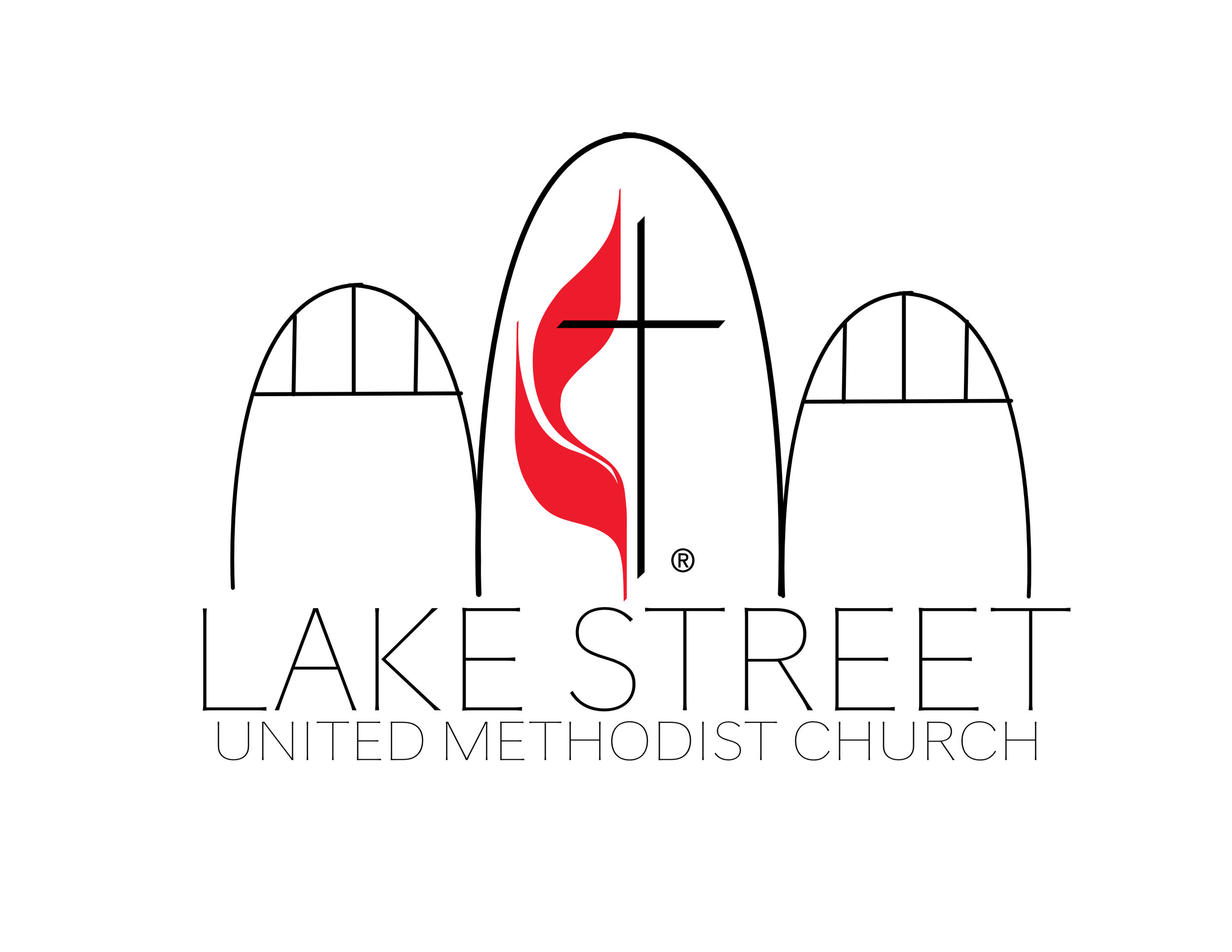
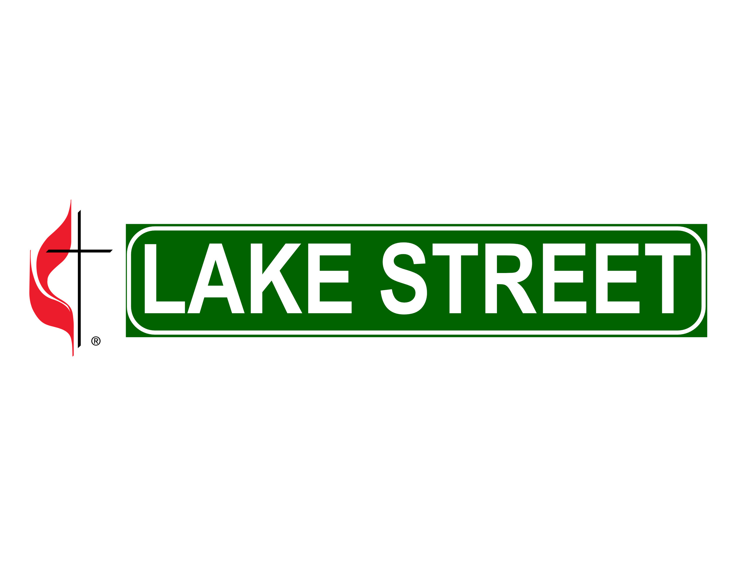
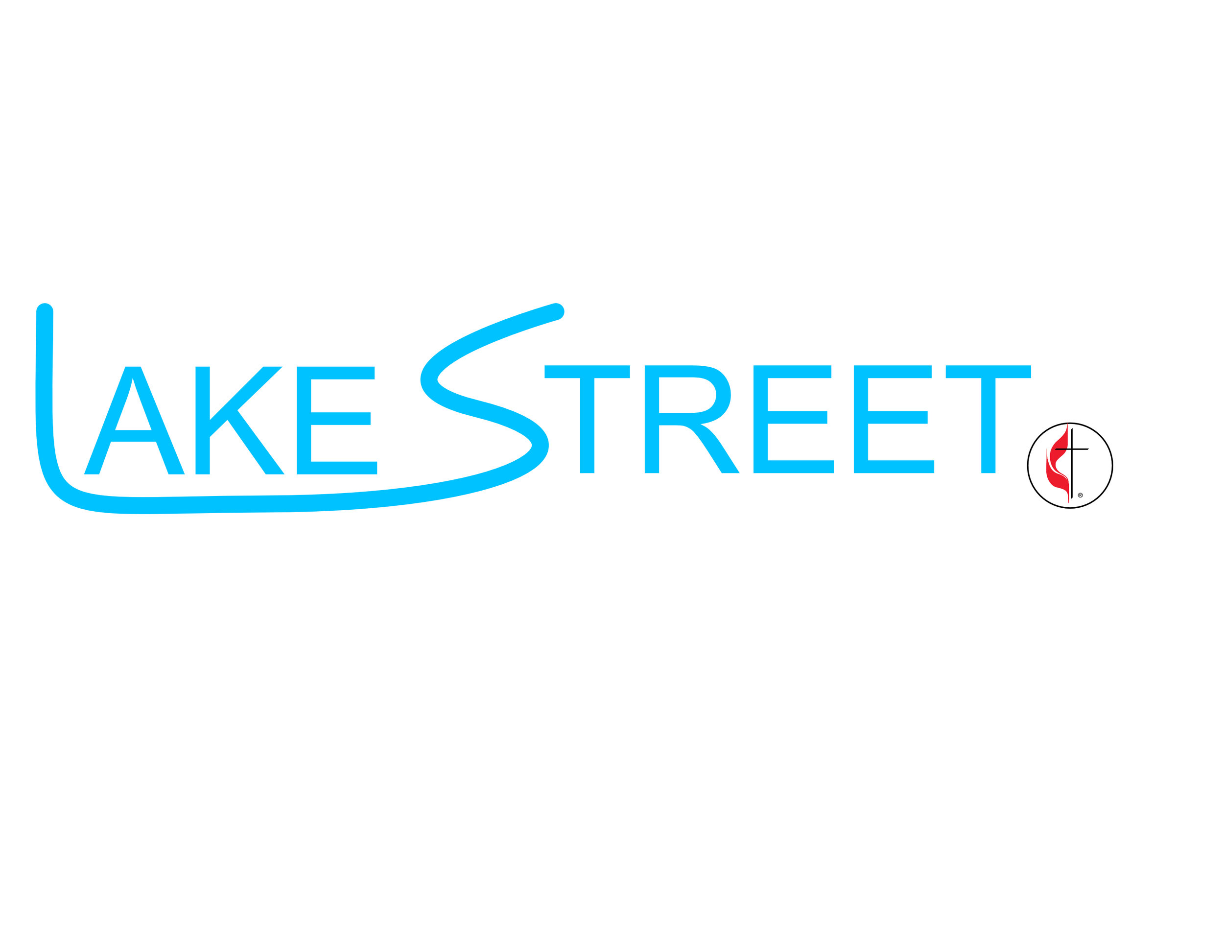
From left to right, the first was inspired by the architecture of the sanctuary - the shapes are the huge gothic arches in the front of the church. Obviously this was just a rough sketch so they're fairly round. This was also my "super modern" design with thin lines, sleek font, and neutral colors. The middle design I was less proud of just since it looked kind of junky, but the sentiment was still there - Lake Street (the actual street, not just the church) is an iconic street in downtown Eau Claire, so I thought it'd be cool to capitalize on that in order to hit the history and location checkboxes from our design meetings. Then the last design I actually liked quite a bit and I would have enjoyed pursuing more. I combined the L and the S into a single stroke to represent the nearby river that cuts through downtown (the river our city was built around), I enjoyed the light blue color for a calm, welcoming feel, and the Methodist logo was still present but less dominant. After presenting these three options, they wanted to see various match-ups of the components of each design (except for the blue one...that didn't get any thumbs up...a fine example of why you have people review your work - you may really like the potential in something, but if it falls completely flat with the intended audience why bother?) along with a more detailed version of the first design. I came up with these revisions:
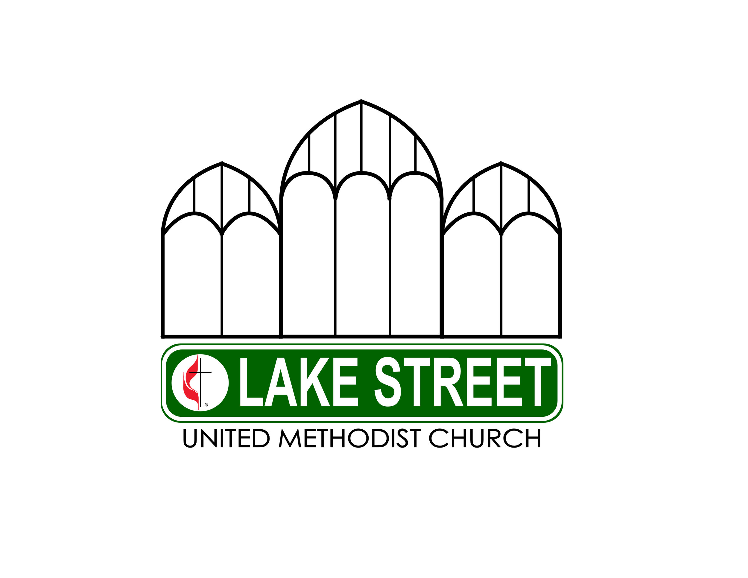
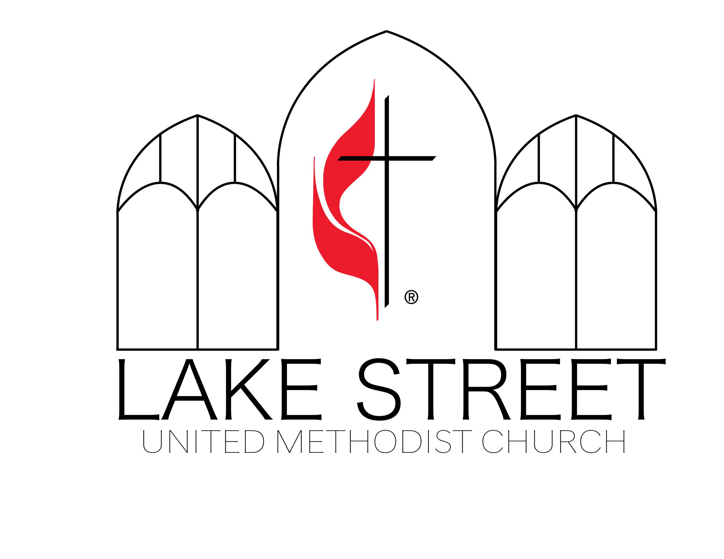
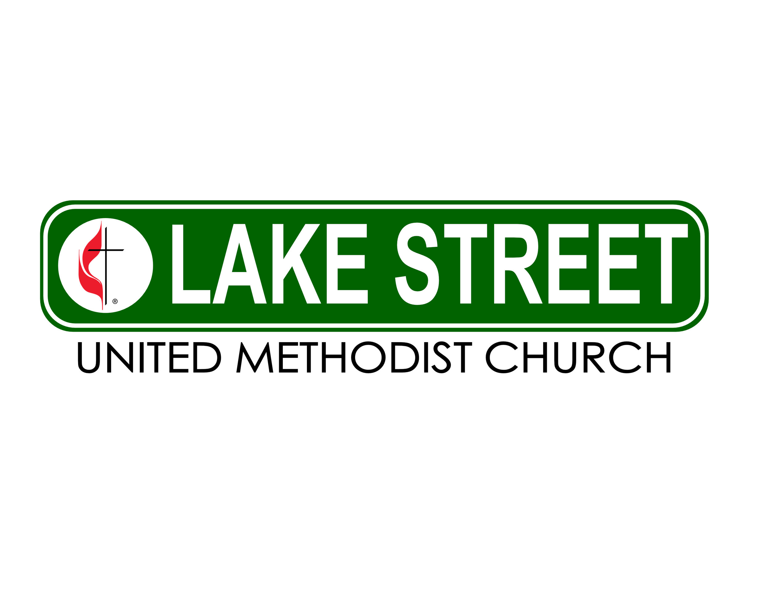
The main feedback on the street sign design was to move the Methodist logo onto the sign rather than sitting off to the side. They also wanted to see the sign with more rounded corners - I had gone for the usual design you'd see on the streets with sharp corners but a rounded rectangle lining it. But I actually like the full rounded rectangle design seen here better anyway. Then of course I did more work on the architecture design to better represent my full vision for it. And as you can see, that's the design we stuck with for the final logo (after some slight modifications to open it up more, accentuate the center arch, and emboldened all of the font), which is now in use by the church and printed on all of their communications like weekly bulletins, newsletters, and letterhead, and also used on their website:
